- My personal opinion (yes this area is totally personal, so I say what ever I want) is that Art is everything that transcends and communicates with God (or the survival of our historical moment in time),
it is stupid
to pretend that a shaman, call him an artist, is going to mark unalterable paths or laws in his attempt to transcend.
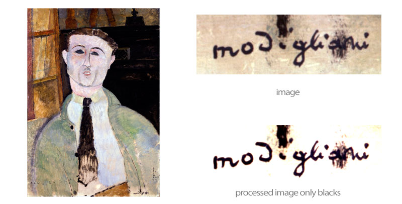
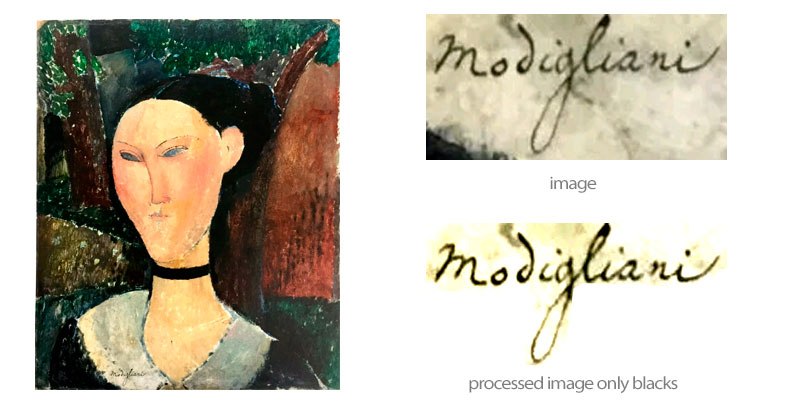
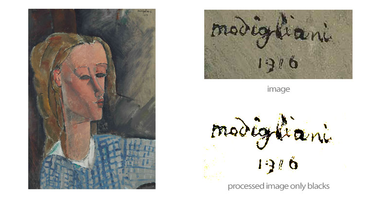
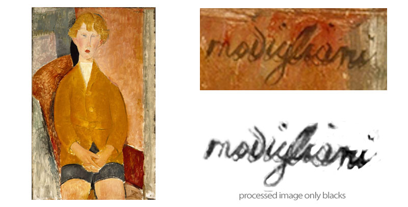
Modigliani's oeuvre is an evolution and a constant change and in the signatures the same changeis visible.
Experts say that
in his early work we see huge signatures in red or white. Once settled in Paris his signatures lost preponderance and become more quick and spontaneous
In his last works they tend to be more softer .
But all this is a nonsense because in the same period we find signatures that do and are exactly the opposite to the previous (if we see the complete signatures in Ceroni by
time table we get the conclusion that there is no possible conclusion...)
- Modigliani was a self-destructive person with strong passive aggressive tendencies what lead him not to mark his achievements as his own with all the preponderance that can be seen in much
more egomaniac artists such as the case of Picasso.
- in easy words, his signature was not precisely what most concerned him in his work in fact the number of unsigned works is quite high for an artist of his time.
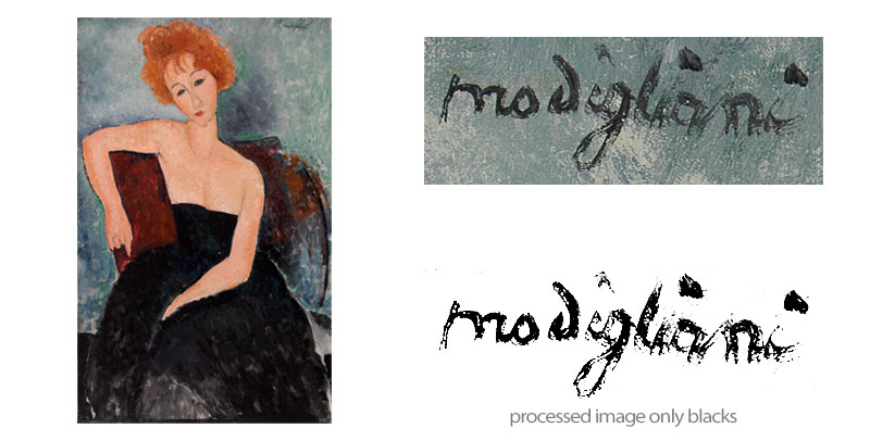
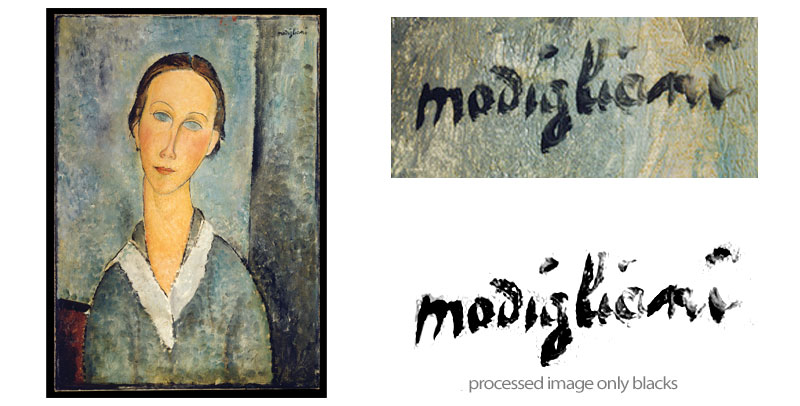
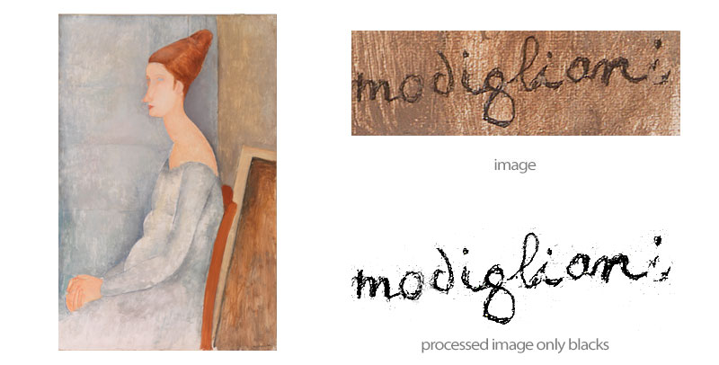
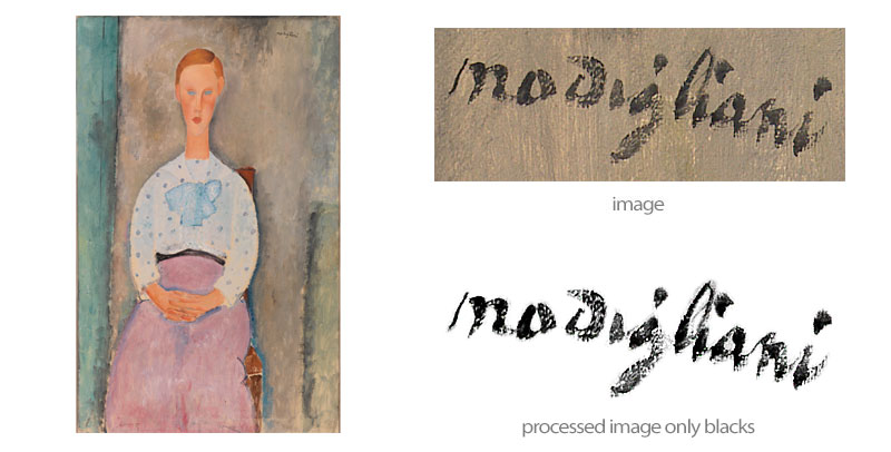
Here are some examples using only absolutely undoubted works: |
 |
 |
 |
 |
 |
Take a look at this one because it shows exactly all the things that Restellini who calls himself as the only valid "market expert" say that show it´s fake:

This is the black extracted from the color:

it shows:
1.- Capital "M"
2.- No closed "o"
3.- "Mod" in a group
4.- lonely "i"
5.- "gliani" in a group
6.- "i" prolongation broken

1915 - Young girl
( and of course I do not say this painting is fake or not) |
| SIGNATURES FROM 1915 |
 |
 |
This Signature is dated in 1915
1.-
" m" in minuscule attached to the o all in one stroke
2.- Separate letter "d" constructed in one simple stroke, almost closed
3.-
Letter "i" entering inside the "g"
4.- "gli" in a continuous stroke, lower part of the g round and bigger than top part
5.- "ani" in one continued stroke
6.- Light curve, not a straight line, domed to top at the center |
This Signature is dated in 1915 (by the artist in another area )
1.-
" m" in minuscule separate from the rest
2.- "o" almost open on top separated from the rest
3.- Separate letter "d" constructed in one simple 5 linear strokes very open.
4.-
Letter "i" separated from the rest
5.- "gli" in a continuous stroke , lower part of the g more linear and smaller than top part
6.- "ani" in one stroke with a bigger "n" than the rest
7.- almost straight line, direction increasing to the right angle 20º |
 |
 |
This Signature is dated in 1915
1.-
" m" in minuscule attached to the "o", o is constructed in two strokes
2.- Separate letter "d" constructed in one simple stroke, almost open
3.-
Letter "i" separated from the rest no dot
4.- "gli" in a broken stroke, smaller i than other letters, lower part of the g round and broken
almost same than top part
5.- "a" separated from the rest with almost a "o" configuration.
6.- "n" in two strokes isolated from the rest.
7.- "i" isolated from the rest, very prominent dot
8.- Light curve, not a straight line, domed to bottom at the center |
This Signature is dated in 1915
1.- Letter "M" very elaborated in capital letter separated from the rest
2.- Separate letter "o" constructed in one simple stroke, closed on top
3.-
Letter "d" separated from the rest closed and in one stroke
4.-
Letter "i" separated from the rest
5.- "glia" made in a continuous stroke with lower side of the g very elongated and thin.
6.- "ni" in one stroke with a very elaborate letter i in the end.
7.- Straight line
8.- Very thin and calligraphic handwriting |

Conclusion for 1915, the four firms of undoubted works are absolutely opposite among them, they have been calligraphically made by the same person but visually they are absolutely different.
If we base our opinion on one as a basis or norm, we would have as a result that the other three would be false.
A reductionist idea. |
| 1916 |
 |
 |
This Signature is dated in 1916 (by the artist)
1.- Letter "M" very elaborated in capital letter separated from the rest
2.- Separate letter "o" constructed in one simple stroke, closed to the left side
3.-
Letter "d" separated from the rest open made in stroke and decorated with 3 little strokes
4.-
Letter "i" separated from the rest, dot blurred
5.- "glian" made in a continuous stroke with the g almost equal.
6.- Very elaborate letter "i" in the end.
7.- 45º Ascending from left
8.- Dating 1916 and text Paris almost lost (blurred) |
This Signature is dated in 1916 (by the artist)
1.- " m" in minuscule attached to the "o", o is closed and constructed in one stroke, out to the bottom
2.- Separate letter "d" constructed in two strokes, almost closed
3.- "igli" in a stroke, g tendency to bottom and l with a coming back stroke
4.-
Letter "a" separated from the rest, double stroke on top
5.- "n" made in a continuous stroke separated from the rest
6.- letter "i" alone in one stroke
7.- Light curve, not a straight line, domed to bottom at the first 4 letters
8.- Dating 1916 in a second line |
 |
 |
This Signature is dated in 1916
1.- Letter "M" very linear in capital letter separated from the rest
2.- Letter "O" very linear in capital letter separated from the rest
3.-
Letter "D" very linear in capital letter separated from the rest
4.-
Letter "I" very linear in capital letter separated from the rest
5.- Letter "G" very linear in capital letter separated from the rest
6.- Letter "L" very linear in capital letter separated from the rest
7.- Letter "I" very linear in capital letter separated from the rest
8.- Letter "A" very linear in capital letter separated from the rest
9.- Letter "N" very linear in capital letter separated from the rest
10.- Letter "I" very linear in capital letter separated from the rest
11.- Linear signature with only the O out of the main line |
This Signature is dated in 1916
1.- Letter "m" in minuscule letter separated from the rest
2.- Letter "o" in minuscule letter separated from the rest
3.-
Letter "d" in minuscule letter separated from the rest
4.-
Letter "i" in minuscule letter separated from the rest
5.- Letter "g" in min. separated with lower side in the shape of an eye
6.- Letter "l" in minuscule letter separated from the rest
7.- Letter "i" in minuscule letter separated from the rest
8.- Letter "a" in minuscule letter separated from the rest
9.- Letter "n" in minuscule letter separated from the rest
10.- Letter "i" in minuscule letter separated from the rest
11.- Domed signature in the first letter linear in the rest |

Conclusion for 1916, again the four firms of undoubted works are absolutely opposite among them, they have been calligraphically made by the same person but visually they are absolutely different.
If we base our opinion on one as a basis or norm, we would have as a result that the other three would be false ( now it would be 7 fakes).
A reductionist idea. |
| 1917 |
 |
 |
This Signature is dated in 1917
1.- Letter "m" in minuscule letter separated from the rest
2.- Letter "o" in minuscule letter separated from the rest
3.-
Letter "d" in minuscule letter separated from the rest and closed
4.-
Letters "igliani" in one group and made in one stroke
5.- Visible a second line of signature made with a few hairs of the brush while signing
6.- Domed in the first letter linear in the rest with a tendency to fall bottom |
This Signature is dated in 1917
(some experts date it in 1918, others 1917, I' go for this year because of the impasto)
1.- Letter "M" in capital letter separated from the rest
2.- Letter "o" in minuscule letter separated from the rest in flat stroke
3.-
Letter "d" in minuscule letter separated from the rest and nearly closed
4.- Letter "i" in minuscule letter separated from the rest, round dot
5.-
Letters "gl" in one group and made in one stroke, g lower part smaller than top
6.- Letter "i" in minuscule letter separated from the rest, diamond shape dot
7.-
Letters "ani" in one group and made in one stroke
8.- Very much "impasto" (heavy paint) signature in white
9.- Linear in the horizontal |
 |
 |
This Signature is dated in 1917
1.- Letters "mo" in minuscule letter separated from the rest
2.-
Letter "d" in minuscule letter separated from the rest and closed
3.-
Letters "ig" in one group and made in one stroke, g very squared bottom area
4.- "liani" in one group with a strong tendency to right.
5.- Dot at the end
6.- Straight in the horizontal line but out of parallel on the top |
This Signature is dated in 1917
1.- Letter "m" in minuscule letter separated from the rest
2.-
"odigliani" in min. and in one stroke with g very calligraphic long to bottom area
3.-
Letter "i" with an elongation on the end of the i
4.- "liani" in one group with a strong tendency to right.
5.- Dot at the end
6.- All signature was made with an almost dry or empty brush
7.- First letters out of the horizontal line about 10 º on the left side |

Conclusion for 1917, again the four firms of undoubted works are absolutely opposite among them, they have been calligraphically made by the same person but visually they are absolutely different.
If we base our opinion on one as a basis or norm, we would have as a result that the other three would be false (now it would be 11 fakes).
A reductionist idea. |
| 1918 |
 |
 |
This Signature is dated in 1918
This work is absolutely undoubted, it has reference almost to his creation and nobody would dare to say its a fake,
and it's not but if had a painting even the most perfect with same signature under any Morellian art historian your
painting should be instantly a fake one.
1.- Letters "mo" in minuscule letter separated from the rest
2.-
Letter "d" in minuscule letter separated from the rest and open
3.-
Letters "igliani" in one group and made in one stroke, g semi elongated bottom area
4.- Straight in the horizontal line a little domed in the center
5. Double signature
or signed twice ???
( probably it's just another hair of the brush out of place but
since it seems that it has a double
signature then it should instantly be a mistake of the forger, the typical simple opinion) |
This Signature is dated in 1918
1.- Letters "mo" in minuscule letter separated from the rest with closed o
2.-
Letter "d" in minuscule separated from the rest and in one stroke, closed
3.-
Letter "i" separated from the rest
4.- "gl" in one group with a strong tendency to right and calligraphic short g in the bottom.
5.-
Letter "i" separated from the rest
6.-
Letters "ani" in one group made of two strokes
7.- Signature was made with a dry or empty brush at the middle
8.- Domed in the center with a 10º increase on the right side |
 |
 |
This Signature is dated in 1918
1.- Letters "mo" in minuscule separated from the rest, o almost open on top
2.- Letter "d" open and in minuscule letter separated from the rest
3.-
Letters "igliani" in one group and made in one stroke
4.- Dots very strong and in line
5.- Slightly domed in the first letters linear in the rest |
This Signature is dated in 1918
1.- Letter "m" in minuscule separated from the rest
2.- Letter "o" almost open on top, minuscule letter separated from the rest and half made on bottom
3.-
Letter "d" in minuscule separated from the rest and in one stroke, closed
4.-
Letter "i" separated from the rest
5.- Letter
"g" separated from the rest and lower area quite squared made in one stroke
6.- Letters "lian" in group with a strong change of direction in the "n"
7.-
Letter "i" separated from the rest
8.- Dots very strong and in line
9.- Linear increase to the right side 15º |

Conclusion for 1918, again the four firms of undoubted works are absolutely opposite among them, they have been calligraphically made by the same person but visually they are absolutely different.
If we base our opinion on one as a basis or norm, we would have as a result that the other three would be false (now it would be 15 fakes).
A reductionist idea. |
| 1919 |
 |
 |
This Signature is dated in 1919
1.- " m" in minuscule almost attached to the "o"
2.-
"o" in min. almost attached to the"d" by the "d" letter, not by the "o", closed and in one stroke
3.- "d" very open and attached to "o" in one stroke
4.- "i" in a stroke, in minuscule attached to the"g", very strong blurred dot
5.-
Letter "g" elongated almost childish calligraphy style attached to the "l"
6.- "lian" made in a continuous stroke separated from the rest, dot regular
7.- letter "i" alone in one stroke, dot blurred
8.- Light curve, not a straight line, domed to top on center, letters "dig" out of the horizontal
|
This Signature is dated in 1919
1.- " m" in minuscule almost attached to the "o"
2.-
"o" in minuscule open on top and constructed in one stroke
3.- "d" round almost closed and isolated from the rest in one stroke
4.- "i" in a stroke, in minuscule separated and with regular dot
5.-
"g" elongated in expressive form on top of the "li" , seems that the "l" was retouched.
6.- "lian" made in a continuous stroke separated from the rest, dot out of place but regular
7.- letter "i" alone in one stroke, dot blurred to right
8.- Curved, domed to the top in the "gliani" letters |
 |
 |
This Signature is dated in 1919
1.- " m" in minuscule almost attached to the "o"
2.-
"o" in minuscule, isolated, closed and constructed in one stroke
3.- "d" almost closed but open and isolated in one stroke
4.- "glii" in a stroke, in minuscule, the"g" like an eight bigger lower part
5.- letter "i" alone in one stroke, with dry paint at hte end
6.- all dots very regular and in line
7.- Ascending linear, out of the horizontal to 15º up on right side
|
This Signature is dated in 1919
1.- " mo" in min. attached, to the "m" first line isolated and made in two strokes, the "o" open on top in two strokes
2.-
"d" in minuscule, isolated and with tendency to close, in one stroke
3.- "i" in a stroke, in minuscule separated and with dot moved on top of the "g"
4.-
Letter "g" elongated very thin, both circles almost closed
5.- "lian" made in a continuous stroke separated from the rest, dots blurred but regular
6.- letter "i" almost attached, but alone in one stroke, dot blurred
7.-Descending linear, out of the horizontal to 15º up on left side |

Conclusion for 1919, again the four firms of undoubted works are absolutely opposite among them, they have been calligraphically made by the same person but visually they are absolutely different.
If we base our opinion on one as a basis or norm, we would have as a result that the other three would be false (now it would be 19 fakes).
A reductionist idea. |
So to make it clear:
To give an opinionover the authenticity based in the firm of a painting by Modigliani is stupid and childish.
|
 THE PERFECT CANON IN MODIGLIANI SIGNATURES????


